Indicator Overview
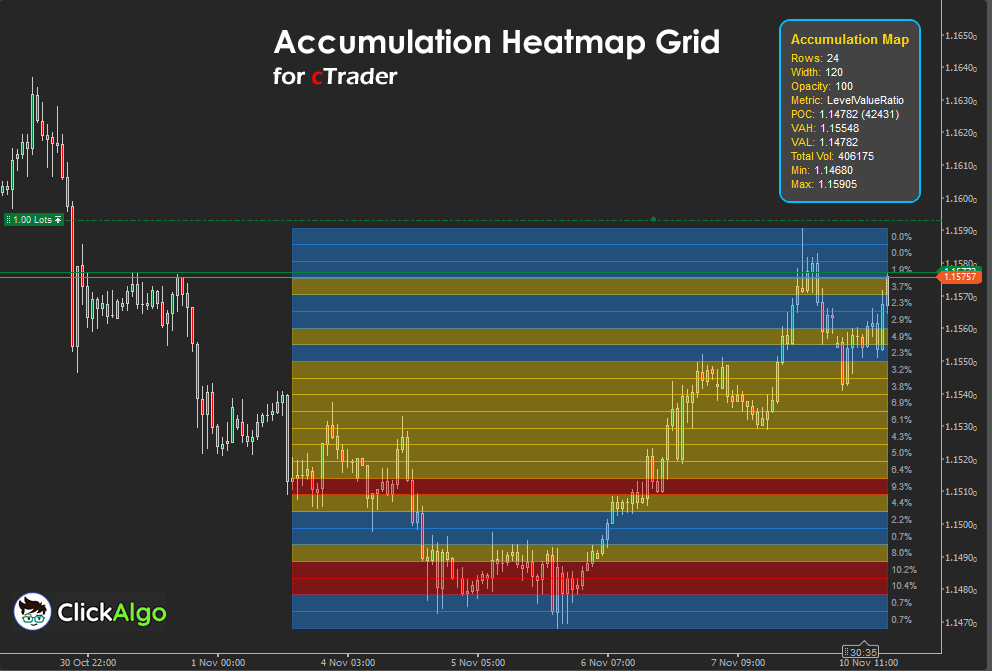
This indicator transforms recent market data into a visual heatmap showing the strength of accumulation across price levels. It calculates relative activity for each price band, using tick volume and candle ranges to create a colour-coded profile. The result is a dynamic accumulation map with percentage values, along with a real-time dashboard displaying key statistics, including POC (Point of Control), Value Area High (VAH), Value Area Low (VAL), and total volume.
i
The cTrader Accumulation Heatmap Grid Indicator stands out for combining the analytical depth of volume profile tools with the visual clarity of a real-time heatmap and data grid. Unlike traditional indicators that show accumulation as static histograms, this tool dynamically maps activity intensity directly on the chart, displaying percentage-based levels, value areas, and control points through adaptive colour gradients. Its integrated dashboard updates in real time to show POC, VAH, VAL, and total volume, giving traders a complete picture of market balance and liquidity structure without switching views. This fusion of quantitative precision, visual insight, and customizable presentation makes it a uniquely powerful decision-support tool for understanding how price and volume interact.
Background & History
Professional traders have long used volume profile and accumulation analysis to understand where liquidity and interest concentrate. This concept, rooted in market auction theory, helps identify areas of value and imbalance. The cTrader Accumulation Heatmap Grid Indicator modernises that principle, using advanced chart rendering to display an intuitive visual map of accumulation strength directly on your chart. It merges the clarity of heatmaps with the precision of grid-based data display.
How the Indicator Works
The indicator analyses recent bars within a specified width and divides the price range into horizontal rows. It then measures the amount of trading activity (based on tick volume and price movement) for each row.
-
Higher-volume concentrations appear in warmer colours such as red or gold.
-
Lower volume or less activity shows as cooler colours like blue.
-
Each row displays its share of total accumulation as a percentage label.
-
The dashboard provides real-time values for POC, Value Area boundaries, total volume, and min/max price levels.
This creates a live snapshot of where the market is building interest and where imbalances are likely to form.
Key Features
The cTrader Accumulation Heatmap Grid Indicator offers a blend of precision and usability through its advanced visual design. It generates a live heatmap showing accumulation intensity across price levels, enhanced by percentage labels that quantify each zone's market share. The built-in dashboard displays essential statistics, including POC, VAH, VAL, and total volume, keeping traders informed of market balance in real time. With full customisation options for colours, thresholds, and layout, it adapts to any trading style or timeframe while maintaining a clean, professional visual structure.
-
Real-time heatmap with percentage grid display.
-
Configurable colour thresholds for high, medium, and low accumulation.
-
Dashboard with POC, VAH, VAL, and total volume statistics.
-
Adjustable number of rows and profile width.
-
Multiple metric options (ratio, proportion, combined).
-
Customizable opacity, text colour, and corner positioning for dashboard layout.
How to Use it for Trading
Trading with the cTrader Accumulation Heatmap Grid Indicator revolves around interpreting where the price interacts with zones of strong or weak accumulation. These zones act as footprints of market participation, revealing where traders are positioned and where future movement is likely to occur. The goal is to use this data to anticipate reactions, continuations, or reversals rather than blindly chase price action.
Begin by observing the high accumulation areas, usually shown in red or gold. These represent price levels where most trading volume or tick activity has occurred. When the price approaches these zones, it often slows, consolidates, or reverses, as these areas act as magnets for liquidity. They are excellent for identifying support and resistance levels or profit-taking targets. If price repeatedly fails to break through a high accumulation zone, it suggests strong defence from either buyers or sellers.
Next, pay attention to low accumulation zones, displayed in cooler tones such as blue. These regions represent inefficiency or thin liquidity, so prices tend to move quickly through them. When a price breaks out of a value area and enters one of these low-accumulation regions, it often signals an impulsive move or trend continuation. Traders can use these thin zones as breakout paths or potential entry zones once the price confirms direction with a strong candle close.
The Point of Control (POC), shown on the dashboard, identifies the single price level with the highest activity during the analysed period. This is where market consensus was strongest. When price trades above the POC, sentiment is generally bullish, while sustained trading below it suggests bearish bias. A break and close beyond the POC often signals a shift in market control.
For range traders, the Value Area High (VAH) and Value Area Low (VAL) help define fair value. Trades can be planned by buying near the VAL and selling near the VAH, with confirmation from candlestick structure or momentum tools. For trend traders, the indicator shows whether accumulation zones are migrating upward or downward; this progression often aligns with institutional positioning and trend continuation.
Beginners should start by observing how price interacts with these zones across different sessions and timeframes. Combine the heatmap with other tools, such as moving averages, RSI, or order flow indicators, to confirm bias. Over time, the visual grid will train you to recognise how markets accumulate orders before making decisive moves, allowing you to trade where liquidity is building rather than reacting after it shifts.
Complimentary Indicators
For deeper context and more accurate trade signals, combine this indicator with:
-
cTrader Volume Heatmap Overlay for tick-based liquidity visualisation.
-
cTrader Market Profile Indicator to see long-term distribution shapes.
-
cTrader Session Volume Indicator to isolate activity by trading session.
-
cTrader Order Flow Tracker to monitor aggressive buying and selling near accumulation clusters.
Inputs & Parameters
The indicator provides full customisation of display style, data metrics, and dashboard position.
| Parameter |
Default/Type |
Description |
| Show Accumulation Map |
true / Boolean |
Toggles the visibility of the accumulation heatmap on the chart. |
| Number of Rows |
24 / Integer |
Defines the number of price levels used to create the map. |
| Profile Width |
60 / Integer |
Sets the number of bars to analyse when building the accumulation profile. |
| Metric Display |
LevelValueRatio / Enum |
Selects how accumulation is measured (ratio, proportion, or combined). |
| High Color |
Red / Colour |
Colour representing high accumulation intensity. |
| High Accum Threshold (%) |
80 / Integer |
Percentage threshold for identifying high-volume zones. |
| Mid Color |
Gold / Colour |
Colour used for medium accumulation strength. |
| Low Color |
DodgerBlue / Colour |
Colour used for low accumulation or weak volume areas. |
| Map Opacity |
100 / Integer |
Transparency level of the heatmap overlay (0–255). |
| Per cent Text Colour |
#FF999999 / Color |
Colour of percentage labels on the right-hand grid. |
| Show Dashboard |
true / Boolean |
Toggles visibility of the statistics dashboard. |
| Dashboard Corner |
TopLeft / Enum |
Position of the dashboard on the chart. |
| Corner Offset X |
20 / Integer |
Horizontal offset from the chart corner. |
| Corner Offset Y |
20 / Integer |
Vertical offset from the chart corner. |
Formula Explanation
The indicator distributes tick volume across price levels and calculates the relative accumulation at each level.
In plain terms:
Each bar’s range is divided into price bins. The indicator adds volume to each bin proportionally, building a profile of accumulated volume across price levels. Then it computes the ratio of each level to total accumulation and displays it as a percentage.
Accumulation per level = Σ(volume × participation at level)
Ratio = (Level Value ÷ Max Level Value)
Proportion = (Level Value ÷ Total Accumulation)
Combined Metric = (Ratio + Proportion) ÷ 2
Advantages
The main advantage of the cTrader Accumulation Heatmap Grid Indicator is its ability to translate complex market data into a clear and visually intuitive format. By blending price, volume, and time into a unified grid, it allows traders to instantly see where the market is building interest and where imbalances are forming. This helps identify potential support and resistance levels with far greater accuracy than standard volume bars or moving averages. The live dashboard provides continuous feedback on value areas, control points, and total accumulation, enabling informed decisions without additional analysis tools. It is equally effective for intraday traders seeking short-term reaction levels and swing traders looking for major zones of value, making it a versatile instrument for understanding institutional behavior and order flow.
Disadvantages
Despite its strengths, the indicator is not a directional or signal-based system, meaning it does not tell traders when to buy or sell. It should be viewed as an analytical layer that enhances decision-making rather than an automated strategy. Because it relies on tick volume data, its accuracy can vary between brokers or assets with inconsistent feed quality. In fast-moving or illiquid markets, updates may appear slightly delayed compared to actual order flow. As with all profile-style tools, interpretation requires some understanding of market structure and context, so beginners should take time to study how accumulation zones behave before integrating it into live trading.
How To Install & Remove
First, ensure the cTrader trading platform is installed. Then unzip the file and double-click it to install automatically.
Need Extra Help?
Get instant answers with cTrader Sensei — our free AI assistant built for the cTrader platform. It can explain the indicator settings, suggest trading strategies, and guide you step-by-step in using this indicator. Rated 4.9 out of 5 in the ChatGPT Store.
Chat with cTrader Sensei.
Prefer human help? Visit our support forum where our team and community can assist you.


